Opens a WhatsApp chat with the model, the reference and this page already written into the message.
Nothing is sent until you press send. Prefer to write it yourself? Use the inquiry box further down.
About this watch
Design and details
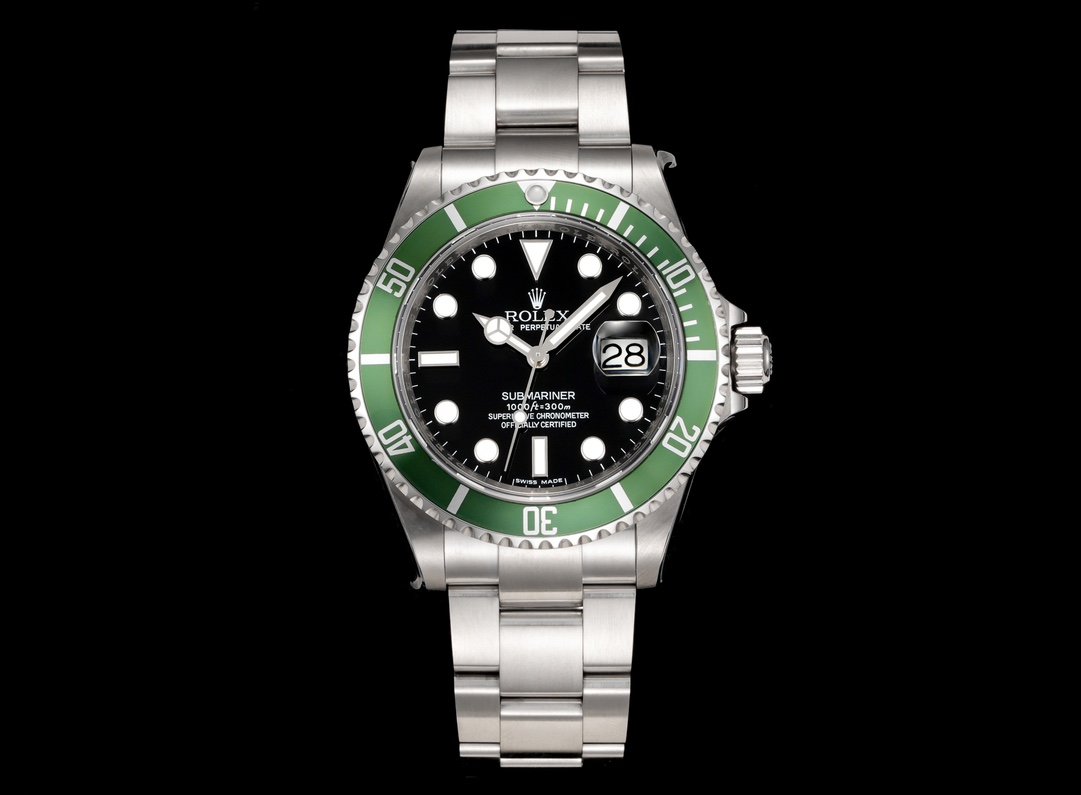
This is the green-insert Submariner Date: the same case, dial layout, hands and bracelet as the black-insert reference in this collection, with the colour moved to the one part of the watch that surrounds the dial. Reference 126610LV pairs a black dial with a green sixty-minute insert, so the colour frames the dial instead of appearing on it, and the date sits at three o’clock under a magnifying lens.
Everything on this page describes the named reference and what the photographs in the gallery show. Which version of the watch is offered, what is fitted inside it, which bracelet it arrives on and how it has been tested are confirmed in the conversation, and the questions worth asking are listed with the inquiry further down the page.
What a green insert does to a black dial
On an all-black dive reference the bezel reads as a frame around the dial: it is there, it carries the scale, but it does not compete for attention. Moving the colour to the insert reverses that relationship. The dial stays black with light markers and light print, the case and bracelet stay in one silver-tone, and the only large coloured surface on the whole watch is the ring surrounding the dial. At arm’s length the eye registers the shape of the watch first and the colour second, which is why the change costs nothing in legibility even though it changes the character of the piece completely.
What does not change is everything else. The marker ring keeps its triangle at twelve and its rectangles at three, six and nine; the hands keep their shapes; the minute track still runs around the inside of the markers; and the date still occupies three o’clock under a magnifying lens. Inside the series, that makes this a question about one surface. The photographs here show how the insert sits against the black dial and where its colour sits relative to the case; how a particular insert looks in daylight, and how evenly its colour runs around the ring, is one of the things worth requesting as a photograph rather than assuming from a product frame.
Reading the sixty-minute scale on a green insert
The scale on this bezel is the familiar dive arrangement, unchanged by the colour: a triangle at the starting point, individual minute divisions through the first quarter, then larger numerals at ten-minute steps around the rest of the ring. Used as a timing scale, the triangle is set against the minute hand and the gap that opens between them is the elapsed time. A quarter turn past the marker is a quarter of an hour. It counts minutes rather than converting them into a rate, and the bezel turns one way only so that a knock cannot make an interval look shorter than it was.
What the green ground changes is contrast, not arithmetic. Light graduations on a coloured surface behave differently from the same graduations on a black one, and they behave differently again as the watch moves between direct light and shade: the printed marks can seem to sit further forward or further back depending on where the highlight lands. That is exactly what the straight-on frame in the gallery is for — judging whether the graduation spacing reads evenly around the ring. Whether the numbers stay equally clear under the light you will actually wear the watch in is settled by a daylight photograph of the offered insert, which is one of the items in the inquiry.
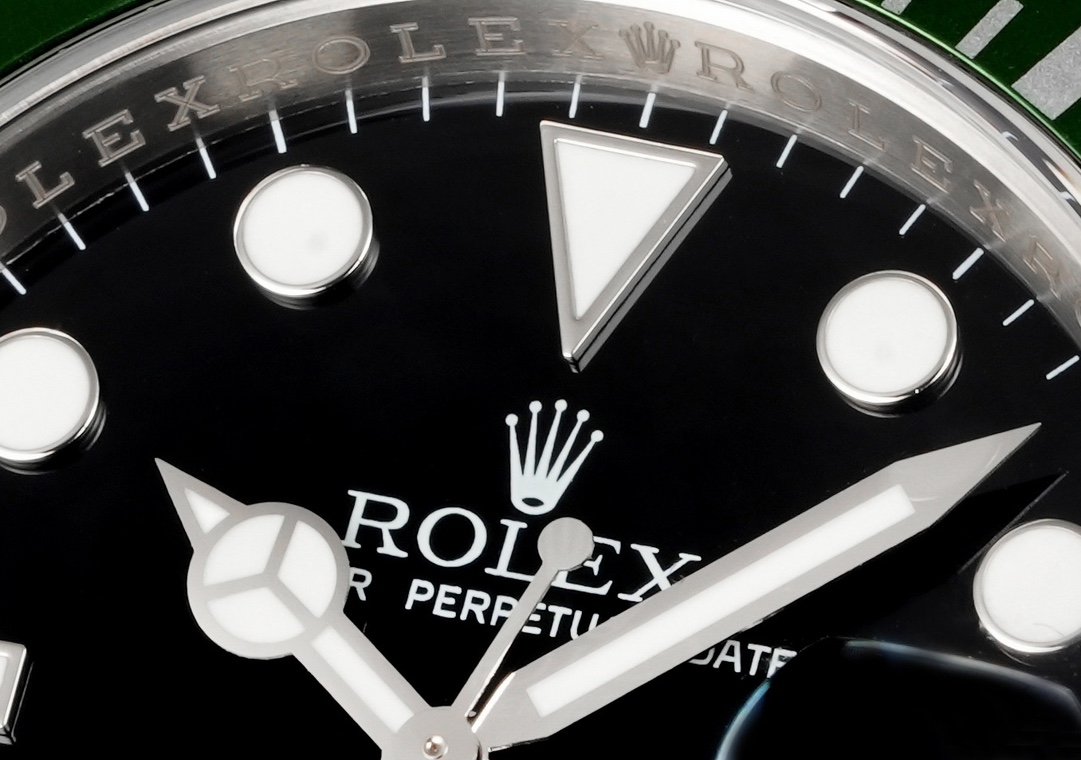
Submariner Date dial close-up showing the marker shapes, the hands, the printed text and the edge of the green bezel
Marker shapes, hands and print on the black dial
The dial uses three marker shapes rather than one repeated form. A triangle sits at twelve, rectangles occupy three, six and nine, and round markers fill the remaining positions. Each one holds a light-filled centre inside a metal-tone surround, so every marker is legible twice over: as a light area against the black ground, and as a defined edge that catches light as the wrist turns. The variation in shape is not decoration. Three distinct forms let you confirm the orientation of a dial at a glance, which matters more on a watch with a bezel scale competing for the same attention.
The hands follow the same logic. The hour hand carries a broad segmented tip, the minute hand is longer and narrower, and a slim seconds hand sweeps across both. When the hour and minute hands sit close together their shapes keep them distinguishable, which is what a dial like this has to get right because there is no second display to fall back on. A fine minute track runs around the dial’s edge, inside the printed ring. The third frame in the gallery is a close view of that area, and it is included because marker alignment and print quality are the two things a photograph settles better than a description can.
The date window and the magnifier at three o’clock
Three o’clock carries a date aperture rather than a marker, and the crystal above it carries a raised magnifying lens. The lens is a three-dimensional element set into the crystal: seen straight on it enlarges the numeral inside the window, and seen from an angle it stands proud of the glass and throws a small bright edge onto that side of the dial. That is the only interruption to the marker ring, and it is the reason the visual weight of the dial leans slightly to the right.
For judging the date, the straight-on frame is the honest one, because that is the only angle at which the numeral’s position inside the window can be assessed rather than distorted. What no photograph can establish is how the calendar behaves — when it changes, how far the crown has to travel to set it, and whether it advances cleanly. Those are properties of the movement inside a specific watch, so they belong with the questions for the watch being offered, alongside any test evidence that comes with it.
The 41 mm case and the proportions of a dive design
The model’s case diameter is 41 mm. On a dive design that figure describes the case body, and the visible size of the watch comes from the whole composition rather than from the dial opening alone: a broad bezel surrounds the crystal, the crown sits on the right-hand side between shaped shoulders, and the bracelet meets the case through fitted end links. Set against the other dive reference in this collection, the proportions are identical — the widest part of the watch is still the bezel, and the dial opening is narrower than the case size might suggest.
That is why diameter alone does not answer a fit question. Lug-to-lug length decides how far the case reaches across the wrist; case thickness decides how it sits under a cuff; and the articulation of the first links decides how the bracelet falls away from the case. Those three numbers describe an individual watch rather than a model, so they are asked for rather than assumed. The same applies to the bracelet itself: how many links can be removed, and how much fine adjustment the clasp offers, are answers about the watch on offer and not about the design.
Choosing inside the Submariner series
Three configurations in this collection are built on the same dive design, and the differences between them are visible ones. One keeps a black insert and a black dial for the plainest reading. One replaces the marker at three with a date aperture and a magnifier. This one keeps the date and moves the colour to the insert. The case, the scale, the hand shapes and the bracelet pattern are common to all of them, so the decision is about which surfaces you want to look at every day rather than about any difference in how the watch is built.
It is worth naming that colour carefully, because the combination has attracted nicknames on the buyer side — “Starbucks” for a green insert over a black dial is the most common one. None of these names comes from the manufacturer, none of them is a reference number, and the same kind of nickname has been attached to green-bezel watches of more than one generation, so a nickname on its own does not identify the watch you will be offered. Quote the reference and describe the insert colour, and the answer will be about the configuration you actually want.
Specification
Specifications and configuration
Model details and design
Detail
Description
Model reference
126610LV-0002
Model size
41 mm
Dial
Black
Date display
3 o’clock, with magnifier
Bezel design
Green insert, sixty-minute scale
Bezel markings (reference design)
The manufacturer describes this reference’s numerals and graduations as coated in platinum; the insert on an offered watch is confirmed in the inquiry
Bezel graduations
Individual marks in the first 15 minutes; ten-minute numerals for the rest
Bezel starting marker
Triangle at zero
Bezel rotation (reference design)
Unidirectional over a sixty-minute scale
Hour-marker layout
Triangle at 12; batons at 3, 6 and 9; round markers elsewhere
Hand arrangement
Central hour, minute and seconds hands
Bracelet design
Three-link, silver-tone
Colour combination
Black dial, green insert, silver-tone case and bracelet
Questions
Frequently asked about this reference
Is “Starbucks” a model name?
No. It is buyer-side shorthand for a green bezel insert over a black dial — not a name the manufacturer uses and not a reference number. Because the same kind of nickname has been used for more than one green-bezel watch, quote the reference when you inquire so the answer covers the configuration you have in mind.
Does the green insert change the bezel scale?
No. The graduation is the same sixty-minute arrangement: a triangle at the start, individual divisions in the first quarter and ten-minute numerals around the rest. Only the surface colour and the way the print contrasts with it are different.
Is the green the same colour as earlier green-bezel Submariners?
That cannot be answered from a model page or from a single photograph. Insert colour varies with lighting and between versions, which is why a daylight frame of the offered insert next to the dial — rather than a comparison with another watch — is what the inquiry asks for.
How is this different from the black-insert reference in the collection?
The case, the scale, the hand shapes and the bracelet pattern are shared. The insert colour is the visible difference, and it is the only one, so the choice comes down to how much colour you want surrounding the dial.
Does the dial tell me what the watch I would receive is rated for?
No. The dial describes the model. The rating, the condition and any test evidence of an individual watch are separate facts, and they belong with the questions asked about that watch rather than with its printing.
What should I include in an inquiry?
The reference, the words “green insert, black dial”, your wrist measurement if you want sizing advice and your destination country — then the questions only the individual watch can answer: which movement is fitted, the measured weight and dimensions, the bracelet supplied and any test evidence.
Inquiry message
The message below is pre-written with the model, the reference and this page. The button opens a WhatsApp draft for you to review before sending.
Which version is available to you, and what it is fitted with, in the green-insert configuration.
Current price for one watch, and the shipping cost to my country.
Which countries you ship to, and the lead time.
Bracelet and clasp variant supplied, how many links can be removed, and what adjustment the clasp offers.
Measured weight in grams, plus the lug-to-lug length and case thickness.
Photographs of the actual watch: the dial straight on in daylight, the green insert straight on, the bracelet closed, the clasp and the case back.